Showing posts with label Graphics. Show all posts

Wednesday, 16 April 2014

EARLY ADVANCEMENTS IN THE PLAYSTATION - PART 2: GRAPHICS

    In 1994, Sony released it’s first console, the Playstation. It’s formation came around from a deal between Sony and Nintendo in 1988. They were working together to develop an add on known as the Super Disc for the Super Nintendo[1]. The collaboration broke apart, with Sony releasing the Playstation, and Nintendo releasing the Nintendo 64 two years later. A more detailed history can be found in the previous blog post I wrote here.

The Hardware used in the Playsation
[2] DAVID LEVERTON (2009) Hardware of the Playstation 1 [Online Image] Available from: http://davidleverton.wordpress.com/category/console-development/ [Accessed 13/04/14]
    The hardware used in the Playstation made it stand above the rest of the 3D capable consoles at the time, as Sony predicted that 3D graphics would be the future of Video Games. Built to run 3D graphics, the console used a processor called the RISC meaning that instructions performed by the processor were simple and fewer, which would allow the system to perform multiple instructions at the same time[3]. All in all this meant that the Playstation had a faster clock speed. Another advantage the Playstation had was that it was able to pull off RAM from the CD and use it in the processing of the game. When you turned off the console the RAM would be purge of all information, meaning it could be used again in a different way the next time you picked it up. To get around the loss of progression in a game the Playstation was produced with ports allowing the use of the companies’ produced flash memory cards to save data.

    What I’ve really been preparing for is talking about the graphical side to the Playstation. I grew up with the Playstation, being one of the first consoles I played as a child, with many fond memories of playing these games. To this day I’ll still play them, having to deal with their now outdated graphics and clunky controls. Maybe I’m nostalgic, but I feel I can appreciate these earlier games and how they became a foundation for the games we enjoy now.
    As the Playstation had a limited proce
ssing power, game designers and art designers had to come up with ingenious ways to lower the processing power or use the technical limitations of the console to their advantage.

    Even with these hardware advancements, Game designers and Art designers found ingenious ways to lower the processing power or use it's technical limitations of the console to their advantage. I'm starting this topic with Crash Bandicoot. 

The early concept of Crash Bandicoot, Willie the Wombat
[4] CHARLES ZEBILLAS, NAUGHTY DOG (1994) Early Concept of Crash Bandicoot [Online Image] Available from:  http://upload.wikimedia.org/wikipedia/en/7/7a/Willy_wombat.jpg [Accessed 13/04/14]
    Released in 1996 the games art style was developed with the idea of lowering the polygon count. Crash was designed to have no neck reducing the amount of polygons on screen. During the transition from concept art to 3D model he lost his tail which appeared in the early concepts to reduce processing power. Crash was also originally design with trousers but this was changed to shorts as the Playstation had issues displaying this without flicking. Designer Charles Zembillas, has stated that Crash’s design was, “51% by technical and visual necessity and 49% by inspiration". This thought also extended into the colour design for Crash. Orange was selected as the main colour to allow for older TVs to play the games without the issue of colour bleeding[5]. Camera placement was also crucial in the maximising the technical limitation, either always pointed down from above the shoulder or pointed from the side. It was unmovable to the player, so assets were allowed to render off screen to keep a stable frame rate and while also hiding the draw distance for the game.

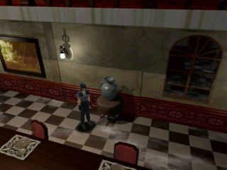
Jill Valentine from Resident Evil featuring the usage of Pre-rendered Environments.
[6] CAPCOM (1996) Resident Evil, Playstation 1 screenshot of Jill Valentine in the Dining Area of the Mansion [Online Image] Available from: http://img535.imageshack.us/img535/2983/ss5cn.jpg [Accessed 13/04/14]
    Resident Evil managed to cut down on processing power by having pre-rendered backgrounds and static camera angles, something which many games implemented after the release of this ground breaking game. Digimon World (1999) and Final Fantasy VII (1997) used this technique to get effects, both creating a full immersive world. The pre-rendered environment meant that a small fraction of the polygon count went to the background, while detailing for the characters increased. The static camera angles were used so only parts of the room had to be rendered helping to reduce the processing power, and again lowering the poly count for the background. But depending on the placement of the cameras it caused the player to feel more tense, a tactic also used in the Silent Hill Franchise.
 
One of Spyro's ingame world, using the Panoramic engine which makes use of Level of detail renders.
[7] INSOMNIAC GAMES (1998) One of the Worlds in Spyro. Available from: http://www.gamasutra.com/features/20000502/spyro_07.gif [Accessed 13/04/2014]
    The Spyro game franchise first emerged in 1998 featuring a completely new way of keeping a high draw distance and having many assets on screen at once. The first game in the series was the first game to use the 3D panoramic engine. This engine allowed the game’s assets to have level of detail renders, which kept a high amount of immersion and gave the game an overall stable performance. This has become a standard in industry now. Spyro also featured almost cutscene like moments in there games which would allow for ingame loading, granting more expansive levels to load without the players knowledge.


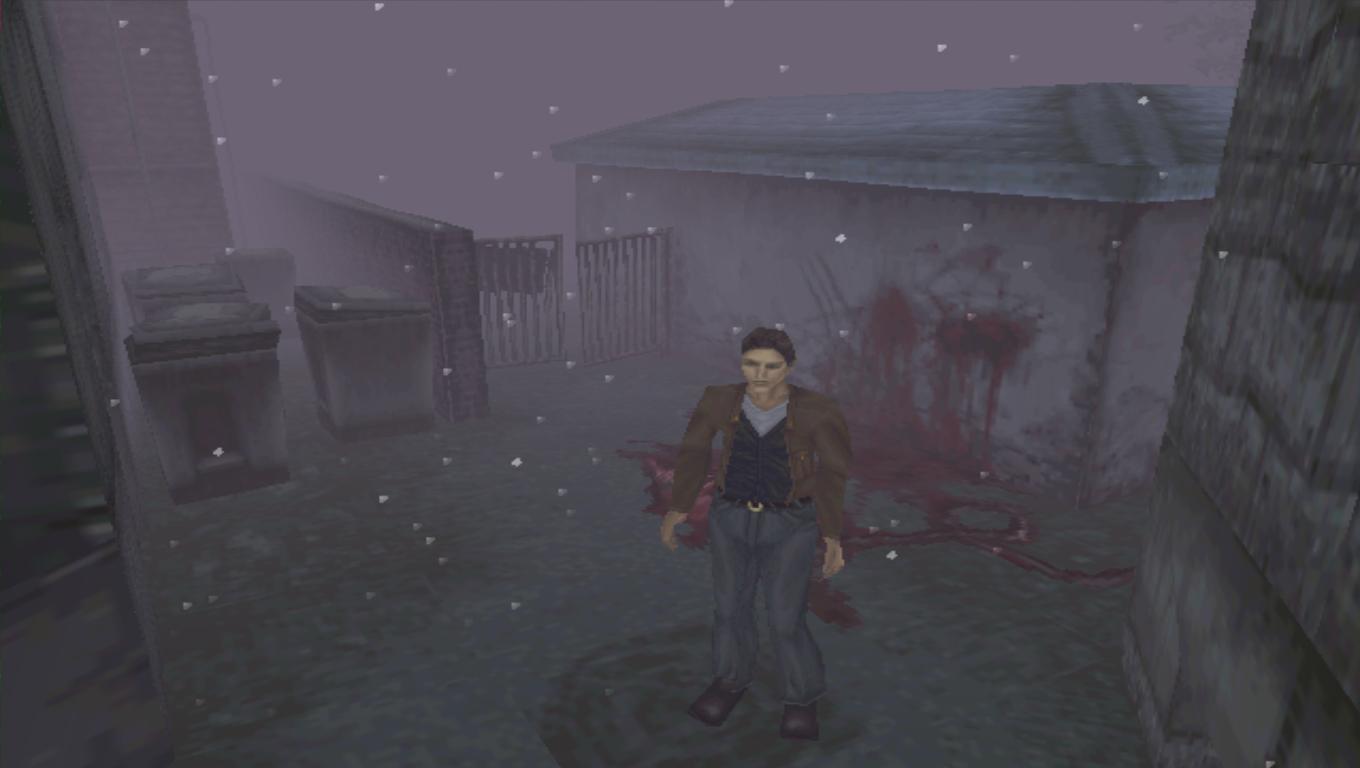
Harry Mason from Silent Hill helping to show the draw distance of the game via the fog.
[8] KONAMI (1999) Harry Mason and Draw distance [Online Image] Available from: https://warosu.org/data/vr/img/0013/34/1389901877596.jpg [Accessed 13/04/13]
    Silent Hill came out in 1999 and used the draw distance in game to their advantage by incorporated the fog into the lore of the game. Fogged over and darkened area only helped add to the games atmosphere, to magnify the tension and the feeling of not knowing what might be a few yards ahead of you.
    All of these techniques allowed for the processing power to be maximised giving the player more content on screen creating full and interesting environments for that time. The only problem now is that the pre-rendered backgrounds now look outdated, as well as the lack of control of the camera which we are used to now mixed in with the game controls made the game feel clunky nowadays.

    From looking at Playstation games, I’ve noticed there is a dramatic split in the art styles at this generation. Half of the games were very stylised allowing for polygons to be saved and creating almost mascot-like characters for the platform, such as Spyro and Crash. While the other half battled with the 3D realism, a long way from the sprites of the NES and SNES age. The realistic games often used the pre-rendered background which can be seen in games such as Resident Evil. All of these elements I looked at in the earlier games were all done using the limitations of the console to their advantage or find ways of limited the processing power to areas where it wasn’t needed, something I personally feel we should look back on and implement in more recent games.
    Pre-rendered background now could be used in isometric view port games with a fixed camera, such as Dungeon Crawlers like the Diablo franchise and the upcoming isometric RPGs suchlike Divinity: Original sin. One game currently in development using this technique is Pillars of Eternity. Their backgrounds look stunning, much like the Resident Evil Remake backgrounds. They do suffer with issues of lighting effects which will always make the background and the figures look off to one another. I feel with more experimentation into this field we can minimise the lightning issues and maximise background animation to allow the models and environment to blend in more as I feel Pillars of Eternity have achieve in their game.


A Pre-rendered Background appearing in Pillars of Eternity.
[9] OBSIDIAN (2013) One of the Pre-rednered Backgrounds in Pillars of Eternity [Online Image] Avaliable from: http://media.pcgamer.com/files/2012/10/Project-Eternity.jpg [Accessed 13/04/14]
     As for level of detail renders, they have become a standard in industry. Elements in the background first spawn into view as image planes, the closer you get to the element, a more simplistic model spawns in it's place gradually getting more and more detailed the closer you come to the element. Plenty of games use this technique now to allow for a more immersive game.

Bibliography

[1] - IGN STAFF (1998) History of the Playstaion [Online] Available from: http://uk.ign.com/articles/1998/08/28/history-of-the-playstation [Accessed 13/04/2014]

[2] - DAVID LEVERTON (2009) Hardware of the Playstation 1 [Online Image] Available from: http://davidleverton.wordpress.com/category/console-development/ [Accessed 13/04/14]
[3] - JEFF TYSON (????) How Playstation Work [Online] Avaliable from http://electronics.howstuffworks.com/playstation2.htm [Accessed 13/04/2014]

[4] - CHARLES ZEBILLAS, NAUGHTY DOG (1994) Early Concept of Crash Bandicoot [Online Image] Available from:  http://upload.wikimedia.org/wikipedia/en/7/7a/Willy_wombat.jpg [Accessed 13/04/14]

  [5] - DYK GAMING (2013)Crash Bandicoot - Did You Know Gaming? Feat. Caddicarus [Online video] Available from: https://www.youtube.com/watch?v=NaLgYPn_Fqs [Accessed 13/04/2014] 

 [6] - CAPCOM (1996) Resident Evil Playstation 1 screenshot of Jill Valentine in the Dining Area of the Mansion [Online Image] Available from: http://img535.imageshack.us/img535/2983/ss5cn.jpg [Accessed 13/04/14]

[7] INSOMNIAC GAMES (1998) One of the Worlds in Spyro. Available from: http://www.gamasutra.com/features/20000502/spyro_07.gif [Accessed 13/04/2014]

[8] KONAMI (1999) Harry Mason and Draw distance [Online Image] Available from: https://warosu.org/data/vr/img/0013/34/1389901877596.jpg [Accessed 13/04/13]

[9] - OBSIDIAN (2013) One of the Pre-rendered Backgrounds in Pillars of Eternity [Online Image] Avaliable from: http://media.pcgamer.com/files/2012/10/Project-Eternity.jpg [Accessed 13/04/14] 

Friday, 11 April 2014

ART DIRECTION ANALYSIS OF HYPER LIGHT DRIFTER

 Please keep in mind at the time of writing this blog post Hyper Light Drifter is currently in development, set for release in mid 2014 so I could jump to incorrect decisions or ideas about this game.

[1] HEART MACHINE (2013) Title Screen. Avaliable from: http://media-cache-ak0.pinimg.com/736x/a1/34/71/a13471171c54e41a71ccf417afe7a670.jpg [Accessed 10/04/14]
 
    Hyper Light Drifter is a pixel based indie game, currently in development by Heart Machine. The game was successfully kickstarted on October the 12th, achieving their set goal of $27,000. The kickstarter for this game was incredibly successful for this five man indie team, receiving funds of $645,158 from 24,150 backers, earning 23 times more than they anticipated[2].

      What originally attracted me to the game was word of mouth via the Co-Optional Podcast[3], hosted by John Baine (TotalBiscuit, the Cynical Brit) with his co-hosts, Jesse Cox (OMGFCata), and Dodger (Presshearttocontinue), featuring Josh Mattingly (Indiestatik) as their guest one week. Mattingly’s job during the streaming of this podcast, involved him being the CEO and founder of the website, Indiestatik[4]. A site devoted to finding new indie games on Kickstater, the Greenlight System on Steam and other such websites, to give them coverage that they might struggled to get between the triple A releases. Conversation during the podcast moved to his job and this game was brought up during the talk.


Video off the Kickstarter Page for the Game.
[5] HEART MACHINE (2013) Hyper Light Drifter Trailer. Available from: https://www.kickstarter.com/projects/1661802484/hyper-light-drifter?ref=project_bar [Accessed 10/04/2014]

    When I reached the Kickstarter I was greeted by the colourful painting above. Its bright and vivid colours drew me in, intriguing me, standing out from the recent plethora of games which feature a saturated or neutral colour scheme. I clicked the play button and what was shown to me invoked an emotional response on par with the Dead Island announcement trailer[6]. The exploration through bright, vivid, wondrous worlds, shrouded in technology, forgotten past, and darkness. Along side the music and gameplay instantly sold this game for me, much like the Dead Island trailer I spoke of above. 
    Having seen the art for a short amount of time, it struck me that the game was partly influence by the art direction of Journey. Coming through with the simplistic depiction of the elements, such as the environments and the characters as well as the usage of colours. The trick of additional simplistic shapes helps to add detail to minimalist environments, making them feel more complex and fuller[7].

One of the many abandoned hallways.
[8] HEART MACHINE (2013) Drifter in ruined hall. [Online Image]. Available from: http://media-cache-ak0.pinimg.com/736x/fc/76/99/fc7699b15d16050eb426828a8991de9b.jpg [Accessed 10/04/2014]
    The surroundings helps to tell the story with decaying machinery, left over skeletons of previous Drifters, broken platforms and fallen buildings descended into disarray hinting at the world’s technological past that fell into ruin. The halls are full of monsters, mixed with areas with little life, helping to add to the feeling of loneliness which appears to be a theme in this story.

The Protagonists of each game with their respective colour schemes.
[9] HEART MACHINE (2013) Figure of the Drifter. Avaliable from: https://www.kickstarter.com/projects/1661802484/hyper-light-drifter?ref=project_bar [Accessed 10/04/14]
[10] THATGAMECOMPANY (2012) Figure of the Pilgram. Avaliable from: http://community.us.playstation.com/t5/PlayStation-All-Stars-Battle/Who-wants-the-quot-Journey-quot-character-as-DLC/td-p/38983287 [Accessed 10/04/14]
[11] RACHEL YEOMANS (2011) Colour Wheel based upon her depiction. Available from: http://www.theworkingwardrobe.com/men_/the-working-man-simple-rules-for-color-coordination/ [Accessed 10/04/2014]
    The two leads feature a similar art style through the usage of minimalistic elements in the design. This comes through in the clothing depictions of minimalistic patterns and using colour to reveal changes in clothing. The faces in each protagonists is extremely minimalistic only featuring the eyes, meaning that the person can identify more with the protagonists as they do not have any obvious personality to dislike.
    I decided to look closely at the protagonists colour schemes, discovering the original colours by manipulating only the saturation and brightness level in order to see if there is a link between the character's overall colour theme and the environment's colour theme. 
 On the left is the Drifter from Hyper Light Drifter clothed in a split complimentary colour scheme. The red in this colour grouping is the dominant colour, the light blue is the tonic, while the darker blue is the mediation, giving a overall colder feel to the character.
    To the right is the Pilgrim or Journeyer from Journey featuring a analog colour scheme from yellow to red. These tones give a warmer appearance, matching the start of the game which occurs in a desert. The environment in this game, also uses a prominent analog colour theme.

    The colours mixed in with the darkness and ruins, creates and holds up a eerie atmosphere, goes away from the typical horror genre appearance of using reds and blacks to promote fear and danger. But the colours also promote the opposite feeling, producing and carry the feeling of wonder, maybe even hope for the future in the abandon hallways. Everything has the air of energy produced by the vivid colours, giving the appearance that everything is alive, brimming with unreleased power.


Screenshots from the Hyper Light Drifter Trailer on the Kickstarter Page. 
[12] - HEARTMACHINE (2013) Hyper Light Drifter Gameplay. Available from: https://www.kickstarter.com/projects/1661802484/hyper-light-drifter?ref=project_bar. [Accessed 10/04/2014]
 [13] - RACHEL YEOMANS (2011) Colour Wheel based upon her depiction. Available from: http://www.theworkingwardrobe.com/men_/the-working-man-simple-rules-for-color-coordination/ [Accessed 10/04/2014]
    I’ve noticed via screenshots of the game and videos, the colours in the bright places compliment one another, while the in the darker areas use an analogous colour scheme. The picture on the left show the complimentary colours of blue and orange, while the picture on the right shows the analogous colours starting with the primary colour of blue, coupled with indigo and aqua which are beside one another in the colour wheel. The analogous colour scheme was used a lot in Journey as the main colour scheme of the environments.

The shades of the Environments in Journey, featuring an analogous colour scheme.  
[14] THATGAMECOMPANY (2012) Shades in Environments. Available from: http://www.creativeuncut.com/gallery-23/art/jrn-world-color-flowchart.jpg [Accessed 10/04/14]
    Analysing this game's art direction I feel that it successes in something I struggle with, the understanding and implementation of colour, especially the bright and vivid ones, using them to produce amazing colourful pieces filled with emotion. While it’s simplistic use of shapes, produce a detailed environment without needing to describe every small bit of detail. As someone who wants to add detail to every little thing, knowing that a few strategic pixels or a few critical lines could show an equal amount of visual information as a highly rendered piece.

Bibliography

[1] - HEART MACHINE (2013) Title Screen. Available from: http://media-cache-ak0.pinimg.com/736x/a1/34/71/a13471171c54e41a71ccf417afe7a670.jpg [Accessed 10/04/14]

[2] - HEART MACHINE(2013) Hyper Light Drifter [Online] KICKSTARTER. Available from: www.kickstarter.com/projects/1661802484/hyper-light-drifter?ref=project_bar [Accessed 10/04/2014]

[3] - JOHN BAINE (TOTAL BISCUIT)(2013) The Co-Optional Podcast Ep. 8 Ft. IndieStatik. Polaris. 19th September Available from: https://www.youtube.com/watch?v=pMkpXEoAv-U [Accessed 10/02/2014]

[4] - INDIESTATIK (2012) About Indiestatik [Online] INDIESTATIK. Available from: http://indiestatik.com/about/ [Accessed 10/04/2014]

[5] - Heart Machine (2013) Hyper Light Drifter Trailer. Available from: https://www.kickstarter.com/projects/1661802484/hyper-light-drifter?ref=project_bar [Accessed 10/04/2014]

[6] - VE3TRO (2011) Dead Island Announcement Trailer. [Online Video] Available from: https://www.youtube.com/watch?v=Gqz-ggWnsV4 [Accessed 10/04/2014]

[7] - IAmSp00n (2012) Journey - Gameplay / Playthrough (No Commentary) [Online Video] Available from: https://www.youtube.com/watch?v=bkL94nKSd2M [Accessed 10/04/2014]

[8] - HEART MACHINE (2013) Drifter in ruined hall. [Online Image]. Available from: http://media-cache-ak0.pinimg.com/736x/fc/76/99/fc7699b15d16050eb426828a8991de9b.jpg [Accessed 10/04/2014]

[9] - HEART MACHINE (2013) Figure of the Drifter. Avaliable from: https://www.kickstarter.com/projects/1661802484/hyper-light-drifter?ref=project_bar [Accessed 10/04/14]

[10] - THATGAMECOMPANY (2012) Figure of the Pilgram. Avaliable from: http://community.us.playstation.com/t5/PlayStation-All-Stars-Battle/Who-wants-the-quot-Journey-quot-character-as-DLC/td-p/38983287 [Accessed 10/04/14]

[11] - RACHEL YEOMANS (2011) Colour Wheel based upon her depiction. Available from: http://www.theworkingwardrobe.com/men_/the-working-man-simple-rules-for-color-coordination/ [Accessed 10/04/2014]

[12] - HEARTMACHINE (2013) Hyper Light Drifter Gameplay. Available from: https://www.kickstarter.com/projects/1661802484/hyper-light-drifter?ref=project_bar. [Accessed 10/04/2014]

[13] - RACHEL YEOMANS (2011) Colour Wheel based upon her depiction. Available from: http://www.theworkingwardrobe.com/men_/the-working-man-simple-rules-for-color-coordination/ [Accessed 10/04/2014]

[14] - THATGAMECOMPANY (2012) Shades in Environments. Available from: http://www.creativeuncut.com/gallery-23/jrn-world-color-flowchart.html [Accessed 10/04/14]